∞ Thu, 21 Feb 2013 · Comments
Google introduced the Chromebook Pixel today, a $1299 laptop that can run Chrome… and that’s it. It’s been rightly ridiculed – if someone has that much money to spend on a laptop, they’ll probably want to run advanced programs like Office, Photoshop, Visual Studio or play resource-intensive 3D games. In that light, the Chromebook Pixel is utterly useless, and consequently I don’t think it will sell particularly well.
However, there’s a much bigger question this apparently pointless device poses: why hasn’t anyone else made a laptop with a 2560×1700 touchscreen (note the 3:2 ratio)?
In other words: why is Google only the second manufacturer, after Apple, to create a laptop with a retina-level screen? Where are all the Windows OEMs?
To be fair, the OEMs aren’t entirely at fault. While the Metro interface in Windows 8 is designed to be scalable across a wide range of pixel densities, the desktop still isn’t. Most applications don’t play nice with the system dpi setting or ignore it altogether, so a 200+ dpi screen on a Windows laptop simply isn’t feasible.
There’s no doubt that high-dpi screens are the future. For most things apart from photos and videos – i.e. text – an IPS panel will be outperformed by a TN panel with higher pixel density (having used both a 4th-gen iPod touch and Surface RT). Of course, most high-dpi screens are IPS, so it’s really a no-brainer. After you’ve seen a high-dpi screen, you’ll never want to go back. And until the dpi reaches laser printer-like levels (600 to 1800 dpi according to Wikipedia) there’s still room to improve. 1080p smartphones like the HTC One are getting close.
All I can say is kudos to Google for having the balls to introduce a premium laptop, even if it may not be a very useful product (yet?). Hopefully it will push Microsoft to fix dpi scaling in Windows so high-dpi laptops can finally break out of the Mac niche.
∞ Wed, 6 Feb 2013 · Comments
The Surface team is currently doing an AMA (Ask Me Anything) on Reddit in preparation for the Surface Pro launch. Here’s an interesting answer I noticed in response to someone asking whether there were any plans for an external battery or a keyboard cover with an integrated battery:
That would require extending the design of the accessory spine to include some way to transfer higher current between the peripheral and the main battery. Which we did…
And another one:
At launch we talked about the “accessory spine” and hinted at future peripherals that can click in and do more. Those connectors look like can carry more current than the pogo pins, don’t they?
This strongly implies that it’s technically possible to charge Surface through the connector for the Touch and Type Covers, which would open the door for future keyboard covers with some sort of integrated battery.
Update: The Verge points out that the Surface Pro has some additional connector plates compared to the Surface RT, so if those future accessories ever materialize Surface RT owners (like me!) might be out of luck.
∞ Mon, 24 Dec 2012 · Comments
Update 26 December, 12:12 UTC: You can simply rename the extension from .m4p to .m4a and the file will play fine. There appears to be no DRM at all. I have no idea why Apple would do this since many apps and devices don’t recognize the .m4p extension, which only leads to unnecessary confusion (and posts like this), but whatever.
I recently noticed, while redownloading some of my past purchases on iTunes, that a few tracks showed up as DRM-protected .m4p files, which was odd since iTunes had dropped DRM for music back in 2009. Plus I remembered that when I originally downloaded the files sometime last year, they indeed were all DRM-free .m4a files.
After buying some new albums a couple days ago and again ending up with an .m4p, I investigated a bit and found that these DRM-protected files all had one thing in common: they were marked as “album only” tracks in the iTunes store, which means that you can’t buy them separately without buying the whole album. All other tracks are unaffected and still DRM-free, however.
This change seems to have occured fairly recently, and without any news coverage or announcement from Apple. All reports that I could find in forums (Algoriddim, Logitech, Apple, Serato) and on Twitter (@talios, @talios) are from the last few weeks.
Hopefully this is just a temporary licensing hiccup that Apple will fix soon – and fix it they must, as the iTunes store is advertised as being DRM-free:
You’ll find more than 26 million high-quality, DRM-free songs on iTunes for just 69¢, 99¢, or $1.29 each.
Also, if you want Apple to do something about this, please help spread the word by upvoting this story on Hacker News or Reddit, sharing it on Twitter or tipping your favorite blog.
Continue →
∞ Fri, 2 Nov 2012 · Comments
From their iPad 4 review:
I have no reason to doubt Cook and Schiller when they say the A6X is a better chip, that it puts the iPad’s performance even further ahead of its competition.
From their Nexus 4 review:
[…] Qualcomm’s Snapdragon S4 Pro clocked to 1.5GHz, which Google says makes this the fastest phone on the planet. I’m not sure that’s an empirical fact […]
All without a single benchmark or other type of objective assessment.
∞ Fri, 3 Aug 2012 · Comments
Pulled directly from the leaked Windows 8 RTM. Preview of what you’re getting. MediaFire mirror.
∞ Fri, 13 Jul 2012 · Comments
Basically allows you to change the skin of the Windows Phone emulator. There already is an application that does the same, but I didn’t really like it (scrolling is awkward, some skins are obviously upscaled from low-res images and thus blurry) so I set out to make my own. It doesn’t have as many skins yet, but the ones it has are all high-quality since they’re based on my PSDs, and as a bonus it doesn’t require any installation, so no harm in trying.
Took two days to make, though most of it was spent polishing the design and deciding on how to implement the skins (you can make your own!). The basic functionality is pretty easy to make, even for me who just got into coding. This is my second application, actually, the first one is a Windows Phone app that I started three weeks ago and submitted to Marketplace on Tuesday.
∞ Fri, 22 Jun 2012 · Comments
I was trying to finally get into some coding today and decided to create a simple stopwatch application for Windows Phone using the panorama control. However, as I’m much more comfortable with Photoshop, I immediately set out to create a good-looking splash screen for the app. I wanted an effect similar to what Apple recommends for iOS apps, which is using a mockup of the actual user interface as the splash screen to provide a seamless app-launching experience. Here’s the result:
Obviously, the app is very barebones at this point, but I’ll hopefully make some progress in the next few days.
Anyway, to achieve this effect, take a screenshot of the last (right-most) panorama screen and shift it 50px 48px to the right (for example using the excellent Paint.NET, if you don’t have Photoshop). If you have a background image, you’ll also need to copy part of it into the splash screen to fill out the newly-empty pixels; if you have a solid background, just fill them with the appropriate color. Now, save this image and set it as the splash screen image. Done!
If you’ve got any questions regarding this trick, feel free to leave a comment. I will try to help where I can.
∞ Wed, 20 Jun 2012 · Comments
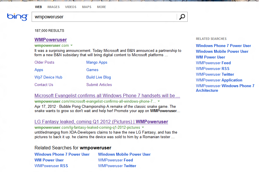
The event which should give us the first look at Windows Phone 8 will be streamed live on Channel 9. We’ll also be live blogging it on WMPoweruser (Andrew Bares is reporting on the ground in San Francisco). Stay tuned, the event starts at 9:00am PT (6:00pm CEST), or in about an hour.
Update: Here’s our live blog on WMPoweruser.
∞ Tue, 19 Jun 2012 · Comments
Can’t tell if MG Siegler is just trolling again or really behind on facts, but hey, let’s break this down, just for fun:
This Surface doesn’t have to just match the price of the iPad, it has to be cheaper. Again, they’re playing catchup. Apple’s margins on the iPad are worse than their other products, but still good. There is some room to undercut them, but that’s assuming Microsoft is able to negotiate the same killer deals that Apple has on components. And this is one of their first forays into hardware. And it is their first foray into hardware of this kind.
The Surface starts with 32GB of storage, and the equivalent iPad is priced at $599. Now, Apple’s higher-capacity models have stupid high margins – the 32GB iPad costs $100 more than the 16GB version, even though the additional flash storage is less than $20 more (according to iSuppli), so there’s definitely lots of room for Microsoft to price the Surface competitively.
But – the Surface doesn’t even have to be cheap. Since it will only be sold through Microsoft’s online store and its less than 30 retail stores, it seems possible that it isn’t intended to be a mass-market device at all. Instead, it could just serve as a wake-up call to OEMs to build better hardware, similar to Google’s Nexus program. Don’t forget that the Nexus One back then really pushed Android hardware forward – it directly led to the much-praised HTC Desire.
Also, undercutting Apple here also means undercutting their own OEM partners. Those guys must already be pissed off at the prospect of this device. And getting into a price war with Microsoft will only piss them off even more. Maybe this drives more of them to Android in the tablet space.
Wait… in case that Microsoft succeeds with the Surface by undercutting everyone, it should suddenly worry about OEMs jumping ship to Android? Sure, they definitely don’t like Microsoft entering their turf, but what options do they have?
By the way, who was that guy again who always shits on Android OEMs for not making any money?
At least Android is free (sort of — coincidentally, most OEMs pay Microsoft to use it). Windows is not free. OEMs will be paying Microsoft to directly compete with — wait for it — Microsoft.
Cluster, meet fuck.
Still the same point, just worded more, ahem, nicely. As he points out correctly, most OEMs also pay Microsoft license fees to use Android, so what’s the difference? And again, what other choice do they have? Oh right, these issues are to hard to explore, let’s just assume it’s all fucked up and throw in some swearing.
And a number of people have remarked about how good this new Surface looks. I don’t know, I look at it and still see the same mistakes that other OEMs that aren’t Apple make. It looks like a big Playbook. Dark. Lots of ports. Blocky. Vents.
So being dark means it looks bad? Lots of ports is bad (are you kidding me?). Blocky, and like a big Playbook. Seriously?
Oh and by the way, those vents are on the Pro version. With Intel Core i5 processor. I heard the iPad is running an ARM processor, like the Surface RT, which doesn’t have any vents.
Warning: Now it gets really interesting, if you will.
Then you add the keyboard and it looks like… a goddamn PC.
I heard Apple sells a keyboard for the iPad too.
While, again, I think the keyboard thing is a smart thing to try to sell units, I have a feeling that in the long run, it will be a burden.
Of course, Apple’s keyboard is no burden.
Does typing on software keyboards suck? Compared to physical keyboards, yes. But the idea should be to reinvent the method of input (see: Siri, for example), not tack on an old one. It’s a crutch. It’s baggage. The only way to move forward is to throw it away.
So, because physical keyboards are much better than software keyboards, they are somehow crutch and baggage?
And yeah, Siri is so much better at text-input than typing.
Again, it looks like a goddamn PC. It’s a keyboard and a screen.
Again, I heard Apple sells a keyboard for the iPad too.
The real problem is with “Surface for Windows RT” and “Surface for Windows 8 Pro”. These sounds like fake names I came up with while drunk last night. But they’re real. I double-checked.
Obviously, “the new iPad” and “MacBook Pro with Retina display” are much better.
But they’re also different sizes, different weights, have different displays, different inputs, different release dates, and run different OSes — and thus, different apps.
Cluster, meet double fuck.
Again, some issues worth exploring, but no, let’s just throw everything together, conveniently ignore some facts (Metro-style apps run on both Surfaces, while legacy apps are obviously only compatible with the Pro version with x86 processor) and assume it’s all fucked up.
But hey, at least Surface for Windows 8 Pro comes with a pen. To quote a guy I once met, “If you see a stylus, they blew it.”
Like, you can throw away the stylus if you want. But it’s actually useful, you know, and even more accurate than those for the iPad.
∞ Tue, 12 Jun 2012 · Comments
This is just too awesome. Civilization III, IV and V are long out, but this guy’s been playing the same game of Civ II for ten years. The game is now in 3991 AD and whether intentional or not, the late-game seems surprisingly “well-balanced”, having become a dystopian mess eerily reminiscent of George Orwell’s 1984. Definitely worth a read (and look).
∞ Mon, 11 Jun 2012 · Comments
I’m not going to regurgitate all the new features in iOS 6. You can read up about them on Techmeme, in case you haven’t followed Apple’s WWDC keynote. Instead, here are some observations about the user interface (all images are pulled from Engadget’s liveblog):
- The cartoonish white status bar, which harkens back to the old iPod days, is gone, replaced by a blue-gradient version which uses the same grey icons of the black/transparent status bar.
- The menu bar is no longer glossy, but just a smooth blue (or white, similar to the iPad) gradient.
- Context menu buttons (?) have lost their gloss as well.
- The App Store and iTunes apps have gotten major redesigns.
This is all I could gather from the screenshots available now. It seems that iOS 6, while not as major an update as iOS 5 or even 4 from a technical standpoint, is the first attempt from Apple – disregarding the iPad, which is another device – to clean up and improve on the original iPhone’s UI design, instead of just adding new features.
∞ Wed, 2 May 2012 · Comments
After messing around with different styles for way too long, Microsoft has finally rolled out what seems to be like a proper redesign for its Bing search engine (only the US version for now, sadly). Only the search results page has been changed, though – the new tiles on the homepage apparently didn’t make the cut.
This is how the new design looks like. It’s much cleaner, I really like it. It’s a little bare bones but that’s nothing bad for a search engine. Hopefully they’ll add the fly-out previews back in; after all, Bing came up with this functionality first, and then Google copied/perfected it.
∞ Sat, 28 Apr 2012 · Comments
Steve Wozniak:
I’m just shocked, I haven’t seen anything yet [in Windows Phone] that isn’t more beautiful than the other platforms.
∞ Fri, 27 Apr 2012 · Comments
Instead of using a lightbox script to display enlarged versions of embedded images, I decided that there was a better solution, for my own needs anyway: images should simply expand to their full size on click. So, I sat down today to figure out how to do that, and arrived at a solution that I feel is good enough for me to replace the otherwise excellent fancyBox with. If you want a quick demonstration of what I mean, head over to my PSDs page – clicking on any image will enlarge it, or you can even click on a special link to quickly toggle all images between regular and full size.
Here’s how to do it. Continue →
∞ Sat, 21 Apr 2012 · Comments
That would be really nice. I used to have Flashblock installed, an addon that blocks Flash by default and lets you activate it with a click. However, sometimes the Flash element simply refused to load after clicking, and the placeholder image was pretty ugly. Hopefully a native solution will work better.
∞ Fri, 20 Apr 2012 · Comments
Pretty impressive. Definitely shows just how big and important Windows still is.
By the way: When the Windows 7 beta was released Microsoft’s servers crashed. No such issues with the Windows 8 Consumer Preview, on the other hand.
However, I think the W8 CP isn’t as stable as the W7 beta was. Maybe my mind is just playing a trick on me here, but I do have some issues with it (text rendering is inconsistent, sometimes random taskbar entries pop up that go away once you click them, and, obviously, all those Metro-style app previews are still very buggy) that I didn’t have back in 2009. I guess I just forgot those…
∞ Thu, 19 Apr 2012 · Comments
Reading Chinese forum posts is hard. While I do speak Chinese, I don’t know Chinese internet slang since I mostly read English (even more than German) on the internet. Anyway, the full story is linked through the title.
∞ Wed, 18 Apr 2012 · Comments
After reading up on all the back-and-forth (I’d recommend Ars Technica and LiveSide for a quick overview of the situation), it seems pretty clear that this is not some random rumor; both The Verge and Mary Jo Foley are hearing that current Windows Phone devices will not get updates to Windows Phone 8.
I mean, if that was not the case, Microsoft would come out with an official statement to clear up the confusion and reassure (potential) buyers, right? But they aren’t.
∞ Tue, 17 Apr 2012 · Comments
Not sure I like this. I was a beta tester for the Android version, but an update promised for early April never arrived, and I didn’t get any emails announcing the change either.
Anyway, Pocket is definitely much improved design-wise, and I can understand the reasoning behind the new name. However, the main list view in the new Android app lags when scrolling, and there’s no clear visual indication anymore whether an article has been saved for offline-reading or not.
The new website is pretty ridiculous. Article headings are way too big, with way too much padding, and placing controls in fixed bars along the top and bottom of the screen… seriously? Just put them in a sidebar and stop wasting space.
But here’s the real bummer:
Once a user starts using us, they use us for years. From a business perspective, having a user pay $2.99 up-front, once, and then use the app for 4 years doesn’t make a lot of sense.
Translation: They’re going to sell subscriptions. Or worse. Seems like the recent explosion in free-to-play/freemium titles that constantly milk people for cash has “inspired” Nate Weiner.
Don’t get me wrong, I really like Pocket (or Read It Later) since I prefer saving the complete webpage over text-only. I will continue to use it. But this sudden change in strategy, essentially screwing over all your earlier customers, is not nice.
∞ Tue, 17 Apr 2012 · Comments
I like the differentiation between Windows 8 and Windows 8 Pro. It’s easy – normal people will just have Windows 8, while professionals and power users get Windows 8 Pro. Basically, Windows 7 Home Basic and Home Premium have been folded into Windows 8, and Professional and Ultimate into Windows 8 Pro. Makes sense.
Technically, there are two more versions – additional “local language-only” editions for China and a few other emerging markets (similar to Windows 7 Starter, I guess) and an Enterprise edition that is essentially the same as Pro, just as in Windows 7 – but most consumers won’t ever hear about them anyway.
By the way, this is really awesome (emphasis mine):
It [Windows 8, the normal version] will include […] the ability to switch languages on the fly (more details on this feature can be found in this blog post), which was previously only available in Enterprise/Ultimate editions of Windows.
Being a German-born Chinese (or German with Chinese roots, whatever), this is a welcome addition. Changing languages really isn’t a power-user specific feature, and the whole implementation in Windows 7 Ultimate felt more like an afterthought to create an artificial selling point (all language packs were permanently shown on the Windows Update page, for example).
Still, the Windows RT branding for the ARM version is confusing. WinRT stands for Windows Runtime, which is the new API for Metro-style apps, so Windows RT stands for… Windows Runtime as well?
I think what Paul O’Brien suggested on Twitter is really smart. Keep the “Windows 8” name in front, and then name the various versions Windows 8, Windows 8 Pro, Windows 8 Tablet, and Windows 8 Phone. The last one would also solve an issue with the current Windows Phone branding, in that many people refer to it as “Windows” instead of “Windows Phone”, as it becomes pretty awkward when you want to say “it’s a Windows Phone 7 phone”. Maybe this doesn’t make sense with Windows 7 – Windows Phone 7 is just too different from its desktop brethren to call it “Windows 7 Phone” – but with Windows 8 adopting Metro, “Windows 8 Phone” seems completely natural to me.